To kick things off, let’s clearly define what a checkout is! According to Big Commerce:
“A Checkout Page is an ecommerce website page that a shopper sees during the checkout process. Those wishing to purchase a product/service will move through a series of checkout pages in step-by-step fashion until the transaction is finalised.”
This definition clearly highlights the importance of the checkout in the customer journey. Any glitch, lack of clarity or trust can lead to the ecommerce nightmare that is cart abandonment! Technical and practical aspects play an important role in creating your checkout, but they are not the only details to take into account.
Iframe: The key to a fluid and optimised user experience
Redirecting the customer or opening a new browser tab for them to enter their payment details is becoming rarer and rarer. Giving the customer any impression that they have left their trusted merchant site to go to an unknown third party provider to process the payment causes friction in the purchasing phase of the customer journey. This is especially true if the third party provider’s site has a completely different style to the merchant’s site.
Thus, in 1997 the iframe was born, enabling elements from other sources (such as a checkout in our case) to be integrated into a html page (a page of a merchant’s site in our case).
Merchants have the choice of two different types of iframe:
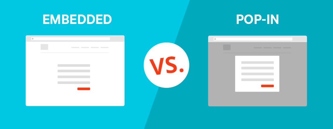
- Embedded: content frame displaying form on the merchant’s website
- Pop-in: content frame opens above the merchant’s web page
An example of an embedded SlimPay iframe
An example of a pop-in SlimPay iframe
This leads us to the question, how do you choose the appropriate type of iframe for your site?
A fundamental question to ask
In reality, if you have to ask yourself just one question it should be the following: when the customer is at the checkout stage, do you want them to be able to interact with other elements on your site?
Let’s take the following example…
On the website of a chain of fitness clubs, the merchant wants to give the customer the opportunity to change the formula selected for as long as possible during the purchase process, including at the checkout stage. It is therefore important that even after the customer has started to fill out information (billing details, mandate signature) that they have some way of “going back” to change their formula, to add, for example, group lessons in addition to unlimited access to equipment. In this case, an embedded iframe is recommended because it does not prevent the customer from “going back” and interacting with the rest of the site until the final moment of payment. Alternatively, if the merchant does not want this possibility, a pop-in is better suited.
How to include an iframe in your design
The embedded mode requires careful thought with regards to the frame size that will host the content included in the merchant’s web page displaying the form, the ideal size is a height of 320 pixels. If the frame’s height is too small, the consumer will have to scroll to fill all fields. On the contrary if the frame is too large, it will be filled with large voids and white spaces, impacting the visual quality of the page. In both cases, the customer experience is impaired.
The pop-in meanwhile provides an automatic adjustment for the height of the frame that appears above the merchant’s page.
To conclude
Live the SlimPay experience!